From Hours to Seconds: Automating Complex Recipe Validation for Therapeutic Diets
A UX case study on designing a human-in-the-loop AI for a complex health workflow, reducing recipe validation for users from hours to just seconds.
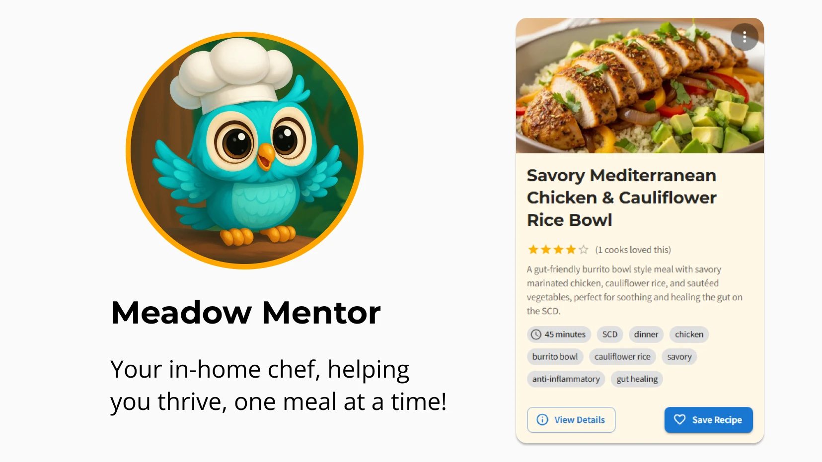
The Challenge
People with gastro diseases such as Celiac disease, and Crohn’s disease sometimes use therapeutic diets to help manage symptoms and disease processes. Therapeutic diets such as the Specific Carbohydrate Diet have complicated rules on which foods are allowed or not. Users must navigate a minefield of misinformation even from medical sources, chat groups, and AI.
Eating the wrong foods can cause flare ups of their disease. Flare ups can do real damage, leading to poor quality of life, lost income potential, broken relationships, surgeries, and medications with side effects. They are overwhelmed with the steep learning curves of the rules and struggle to find safe recipes that are aligned with their dietary needs. Access to safe recipes that are custom tailored is a critical need. This case study outlines how I designed a human-in-the-loop AI system to provide this, reducing recipe validation from hours of stressful research to seconds.
My Role
Sole founder and Product Designer leading the end-to-end design and engineering of the core AI recipe generation feature for Meadow Mentor.
Design Process
Discovery & Research
I had user research interviews with 16 people to understand their core pain points. Many of them said they wanted professional help to make using the diet easier so they could achieve remission. The recurring theme was the stress and time-cost of finding safe recipes they want to eat.
“I am losing energy, very weak and fatigued. Difficult to keep up with the constant food shopping/cooking/cleaning demands.”
Strategy & Ideation
To solve this problem, my goal was to create a system that created recipes in seconds and was 100% validated as safe for users. I settled on an architecture of an AI agent that generated recipes according to the user’s health information. Before showing the recipe, it validated the safety of the recipe’s ingredients against the app’s custom database of food ingredients. This ensured all recipes created for users were 100% aligned with their diet and flare status.
Design and Prototyping
I made a mockup of the recipe card in Figma and used that in Windsurf for the AI to code up the Recipe Card component.
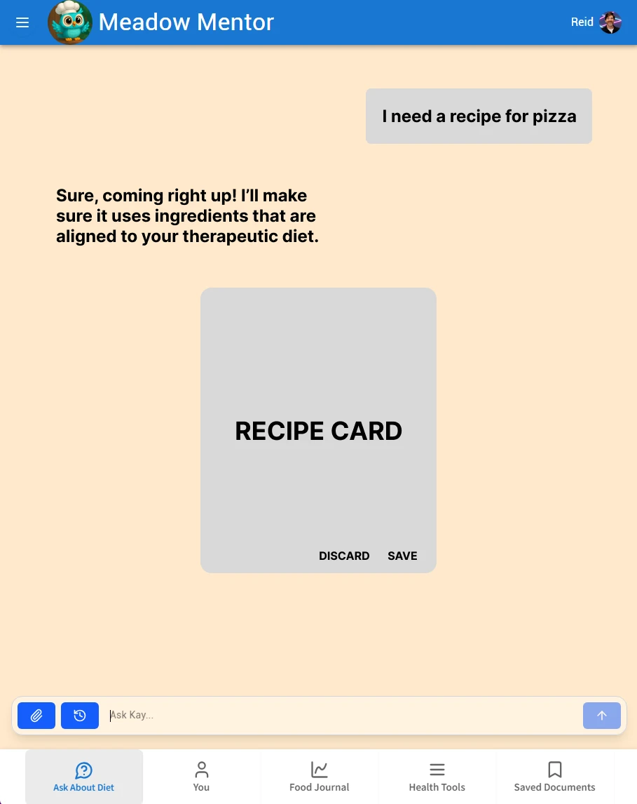
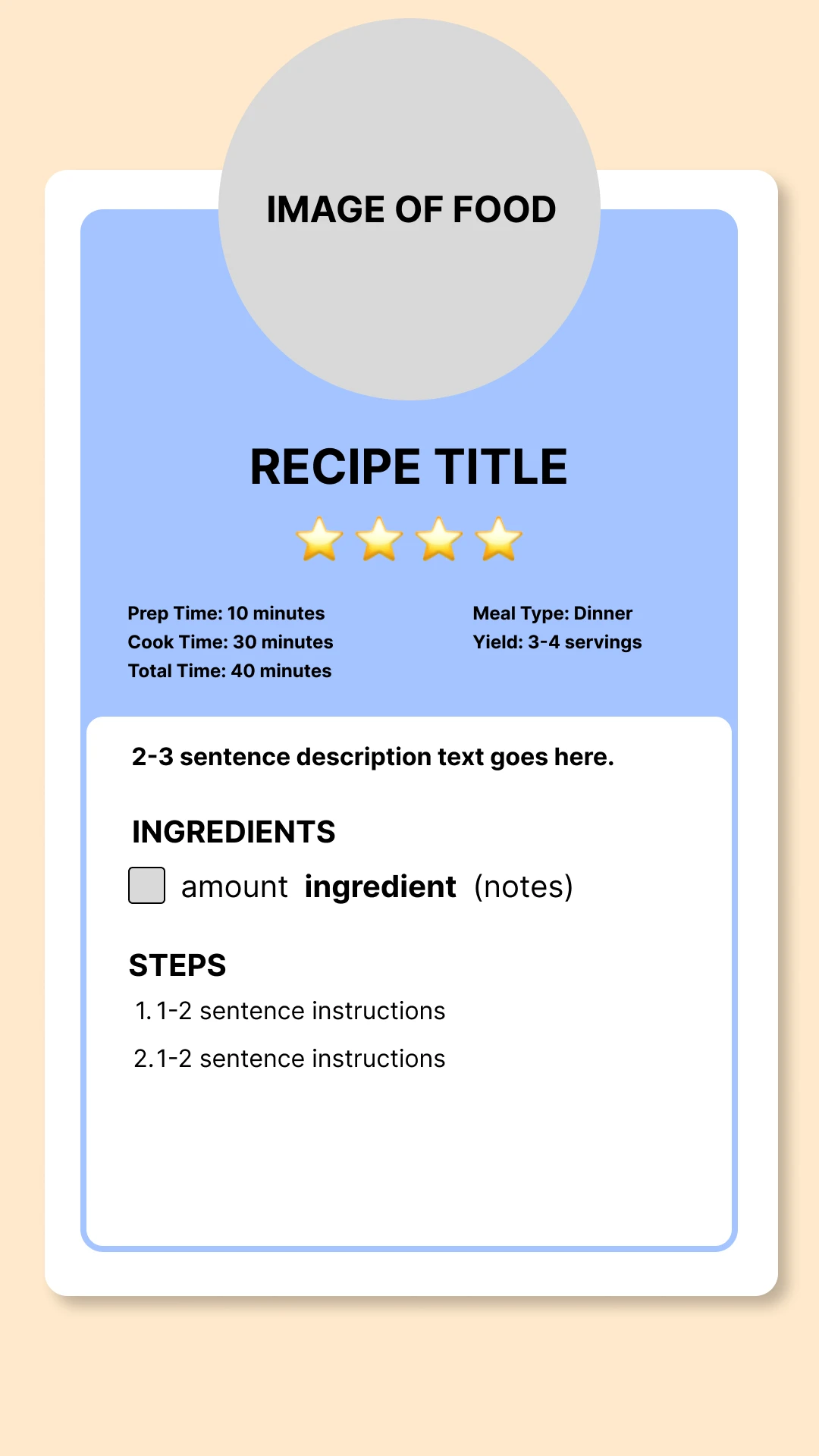
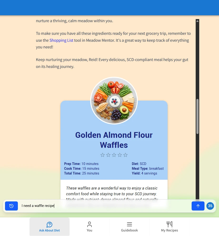
Here’s how it looked in app.
The chat page:
The public recipes page:

Early feedback from users was clear that this design was overwhelming. They didn’t want to see a cluttered page of long ingredient lists and steps in the Recipe Cards. Recipes needed to be fun visually since food was source of stress for users. My goal shifted to designing a “summary card” component that provided just enough information for a quick “yes/no” decision.
A friend shared with me a link to a NYTimes article.
Which gave me some ideas I wanted to explore through many rounds of iteration.

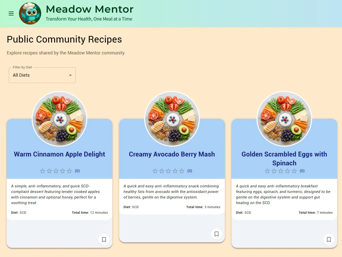
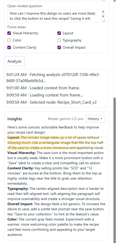
I experimented with tag placement, button placement, and overall information hierarchy. To do this quickly, I used an AI design assistant plug-in I created for Figma. The plug-in analyzed my designs and gave feedback on the key areas I cared about; Visual Hierarchy, Layout, Content Clarity, and Overall Impact. It helped me realize that the photos should be full size, not tiny circles.
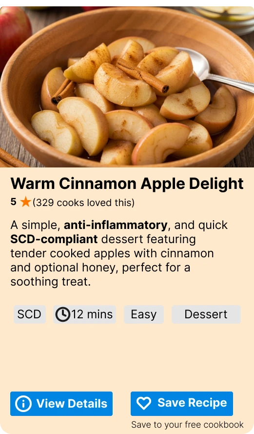
Here’s a few in the later stages of my design iteration.

I played with the information hierarchy a bit because it felt cluttered and disorganized with the buttons on the top and bottom.

Until I landed on this clean looking design that is scannable because it prioritizes a pleasing image, recipe title, and key metadata like diet type and total time. The information flows progressively from big picture idea to granular detailed information. If they like what they see after reading the summary card, they can click the save button at the bottom.
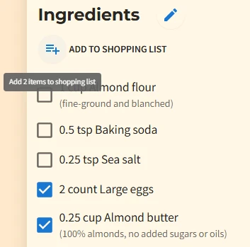
During user testing of the final detailed recipe view, another important insight emerged. A user wanted to add only a few of the ingredients to the app’s shopping list. At that time, they could only add all ingredients or none. Based on that feedback, I implemented the ability to select individual ingredients and add only those to the user’s shopping list. This was a small change, but it significantly improved the feature’s usability and gave users more control, something they want in the management of their health.
Prioritization and Execution
Early on, I hypothesized a food journal would be valuable. But after several months of being in the app, behavioral data showed no one was using it, including myself. It was a distraction from the core problem of sourcing safe recipes. I made the strategic decision to cut it and refocus all efforts on perfecting the recipe generation workflow.
The Solution
Final version ended up looking like this
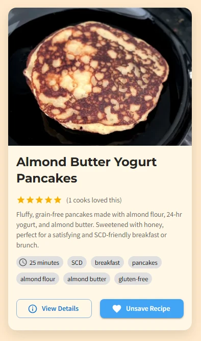
Then when users click on the View Details button they see the full Recipe Card as
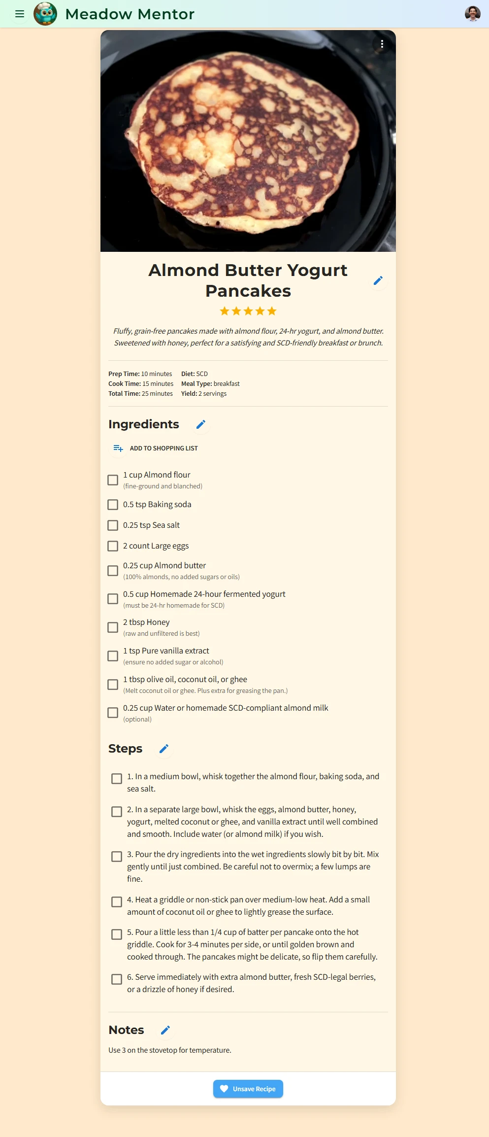
Note the pen icons next to the sections for Title, Ingredients, Steps, and Notes. The recipes are 100% editable by users. My design philosophy with AI is that users need to be in full control over the artifacts created by AI for Human use. Especially in the health space, users often lack control over their bodies early in their disease management. This gives them a sense of much needed control over their healing journey and empowers them to make healthy choices.
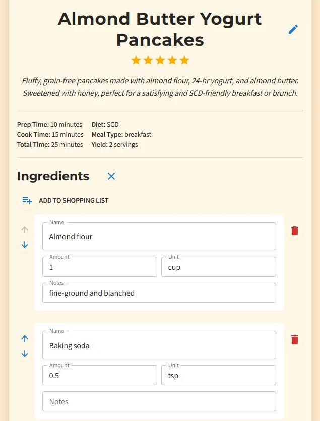
Future versions will allow users to click a button to validate any changed or added ingredients to ensure the recipe remains aligned to their diet and safe.
The Impact
Quantitative
Crucially, the primary impact was on process efficiency. The system reduced the time users spent finding and validating safe recipes from hours of manual research to under 20 seconds.
Qualitative
During a personal flare up I had, I experienced the value firsthand. By inputting my condition and currently active flare status, the app generated a ‘Ginger Carrot Puree’ recipe that became a staple in my recovery. This demonstrated the system’s ability to deliver targeted, effective solutions in real-world scenarios.
Lessons Learned
As a Product Designer, I had grand visions for the app to include a food journal. The journal would allow users to track what they ate and get AI analysis on health trends. However, looking back at usage data, and user research interviews, it was clear they told me they wanted better recipes. I had to put aside my own desires and focus on their needs.
